Chapter 3 Looking at Effects of Fire on Vegetation
“What happens when a wildfire tells you a joke? You get burned!”
This assignment demonstrates the benefit of visualizing data to see potential correlations.
Data and assignment provided by Dr. Matthew Ross and Dr. Nathan Mueller of Colorado State University.
3.1 Introduction
The Hayman Fire, started by arsen in summer of 2002, was the largest wildfire in Colorado history until the 2020 wildfire season. It burned a large area of over 138 thousand acres between the Kenosha Mountains and Pikes Peak, affecting wildlife and causing water quality concerns for the Front Range populations through damage to watersheds that contribute to the South Platte River.
3.2 What is the correlation between NDVI and NDMI?
The Normalized Difference Vegetation Index (NDVI) is positively correlated with the Normalized Difference Moisture Index (NDMI). In everyday terms, NDVI indicates plant health as shown by how well leaves reflect near infrared and red light, while NDMI represents plant water content and is calculated from near infrared and short-wave infrared reflectance values (Agricolus, 2018). These values can also tell us about how much vegetative cover there is at a given site, with the lowest NDVI (<0.1) and NDMI (<-0.8) values indicating bare soil.
Not surprisingly, the plot below shows that canopy cover is greatly decreased for the burned site compared to the unburned site.
#ggplot of wide set in summer
full_wide %>%
  filter(month %in% c(6,7,8,9,10)) %>%
  filter(year >= 2002) %>%
ggplot(., aes(x=ndmi,y=ndvi, color=treatment)) +
  geom_point(shape=1) +
  xlab("NDMI") + ylab("NDVI") +
  ggtitle("Burned vs. Unburned Vegetation") +
  theme_few(base_size = 16) +
  scale_color_brewer(palette = "Set2") +
  theme(panel.grid.major=element_blank(), panel.grid.minor=element_blank(), legend.position="bottom")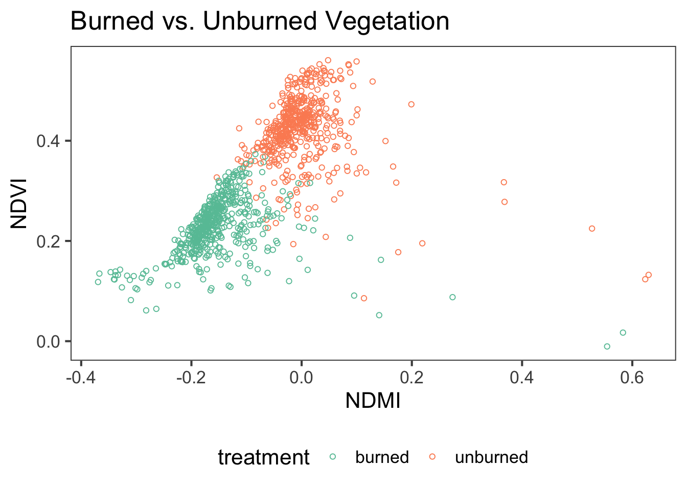
Figure 3.1: NDVI and NDMI values from 2002 to 2019 in Colorado sites that were burned (teal) or left unburned (orange) during the Hayman Fire.
As may be expected, vegetative growth (NDVI) is positively associated with the previous winter’s snowfall, as shown in the plot below.
#ggplot winter NDSI to summer NDVI
ggplot(ndvi_ndsi, aes(x = mean_NDVI, y = mean_NDSI)) +
  geom_point(fill = "blue",
             shape = 21,
             size = 2) +
  geom_smooth(method = "lm",
              se = TRUE,
              lty = 1,
              color = "black",
              fill = "lightgrey",
              size = 1) +
  xlab("Mean NDSI") + ylab("Mean NDVI") +
  ggtitle("Winter NDSI vs. Summer NDVI") +
  theme_few(base_size = 16) +
  scale_y_continuous(breaks = pretty(c(-0.4,0.5), n = 4)) +
  scale_x_continuous(breaks = pretty(c(0.2,0.5), n = 6)) +
  theme(panel.grid.major=element_blank(), panel.grid.minor=element_blank(), legend.position="bottom")
## `geom_smooth()` using formula 'y ~ x'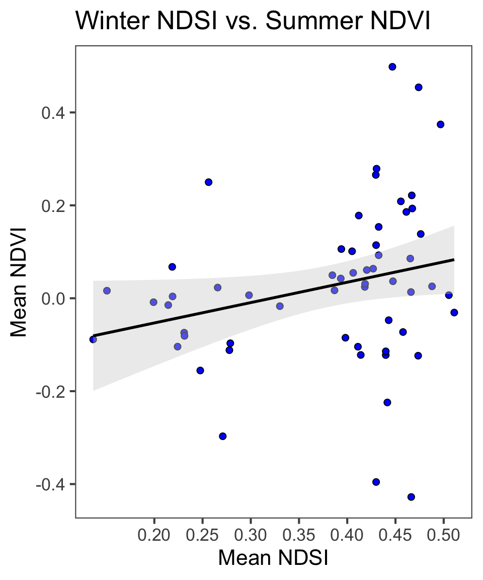
Figure 3.2: Linear models for mean summer NDVI and mean winter NDSI for pre- and post-burn and burned and unburned sites.
3.3 What month is the greenest month on average?
If we plot monthly means of NDVI, we can see that the greenest month in Colorado is August.
#ggplot of monthly means
monthly_sum %>%
  filter(data == "ndvi") %>%
  mutate_at(vars(month), funs(factor)) %>%
ggplot(., aes(x=month, y=value_mean, fill=month)) +
  geom_bar(stat = "identity", width = 0.7, position = "dodge") +
  geom_errorbar(aes(ymin=value_mean-value_std.error, ymax=value_mean+value_std.error),
                colour = "black", width = 0.7, position = "dodge") +
  scale_x_discrete(labels=c("5"="May", "6"="June", "7"="Jul.", "8"="Aug.", "9"="Sept.")) +
  xlab("Month") +  ylab("NDVI") +
  ggtitle("Average NDVI per Month") +
  theme_few() +
  scale_fill_brewer(palette = "Greens") +
  theme(panel.grid.major=element_blank(),
        panel.grid.minor=element_blank(), legend.position="none")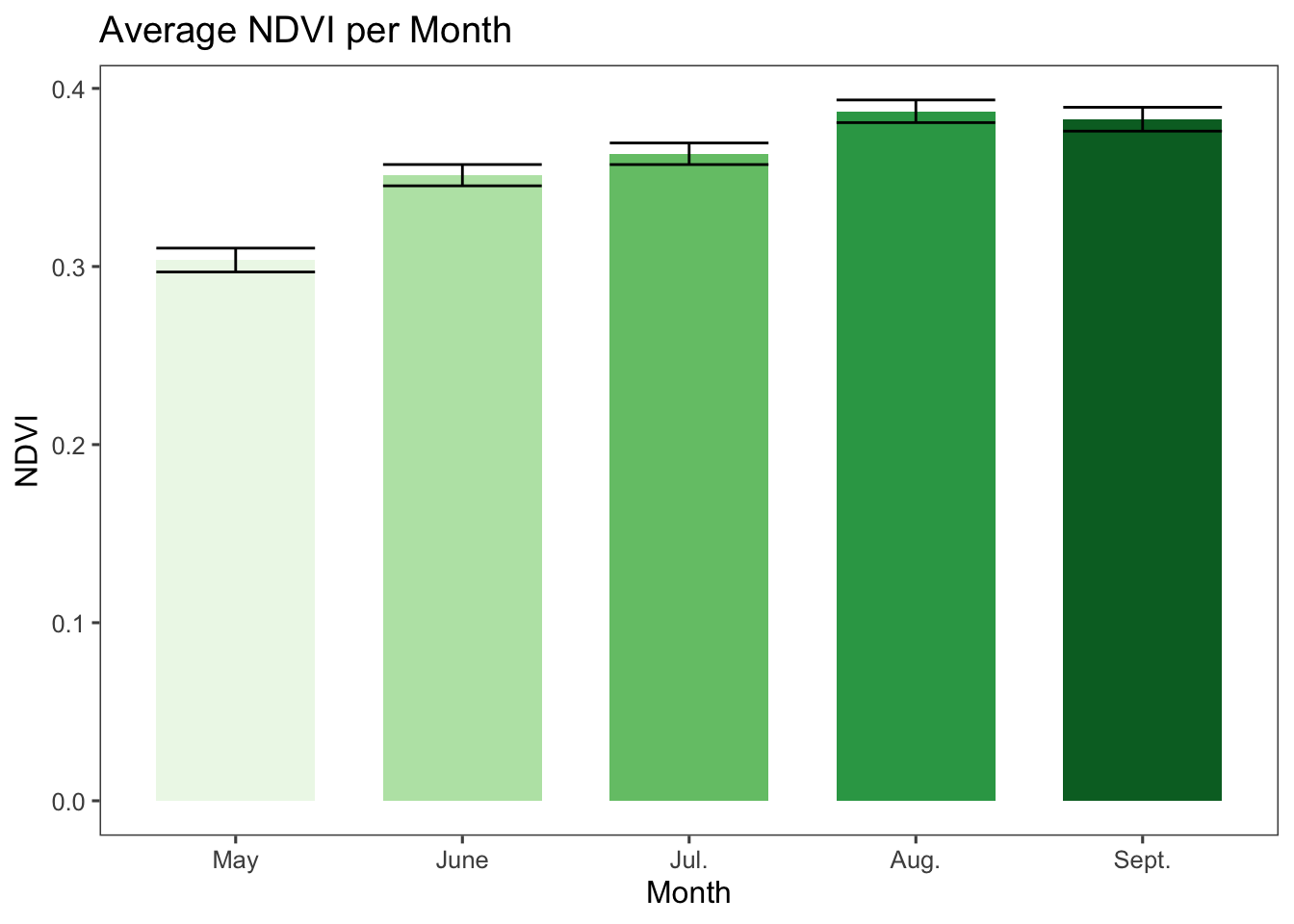
Figure 3.3: Mean NDVI and standard error per summer month across sites from 1984 to 2019.
3.4 What month is the snowiest on average?
If we plot the NDSI means for the winter months, we can see that the highest snowfall is January.
# Change ordering manually and make month into factor
monthly_win$month <- factor(monthly_win$month,
                  levels = c("11","12", "1", "2", "3"))

monthly_win %>%
  filter(data == "ndsi") %>%
ggplot(., aes(x=month,y=value_mean, fill=month)) +
  geom_bar(stat = "identity", width = 0.7, position = "dodge") +
  geom_errorbar(aes(ymin=value_mean-value_std.error, ymax=value_mean+value_std.error),
                colour = "black", width = 0.7, position = "dodge") +
  scale_x_discrete(labels=c("11"="Nov.", "12"="Dec", "1"="Jan.", "2"="Feb.",
                            "3"="Mar.")) +
  xlab("Month") +  ylab("NDSI") +
  ggtitle("Average NDSI per Month") +
  theme_few() +
  scale_fill_brewer(palette = "Purples") +
  theme(panel.grid.major=element_blank(), panel.grid.minor=element_blank(),
        legend.position="none")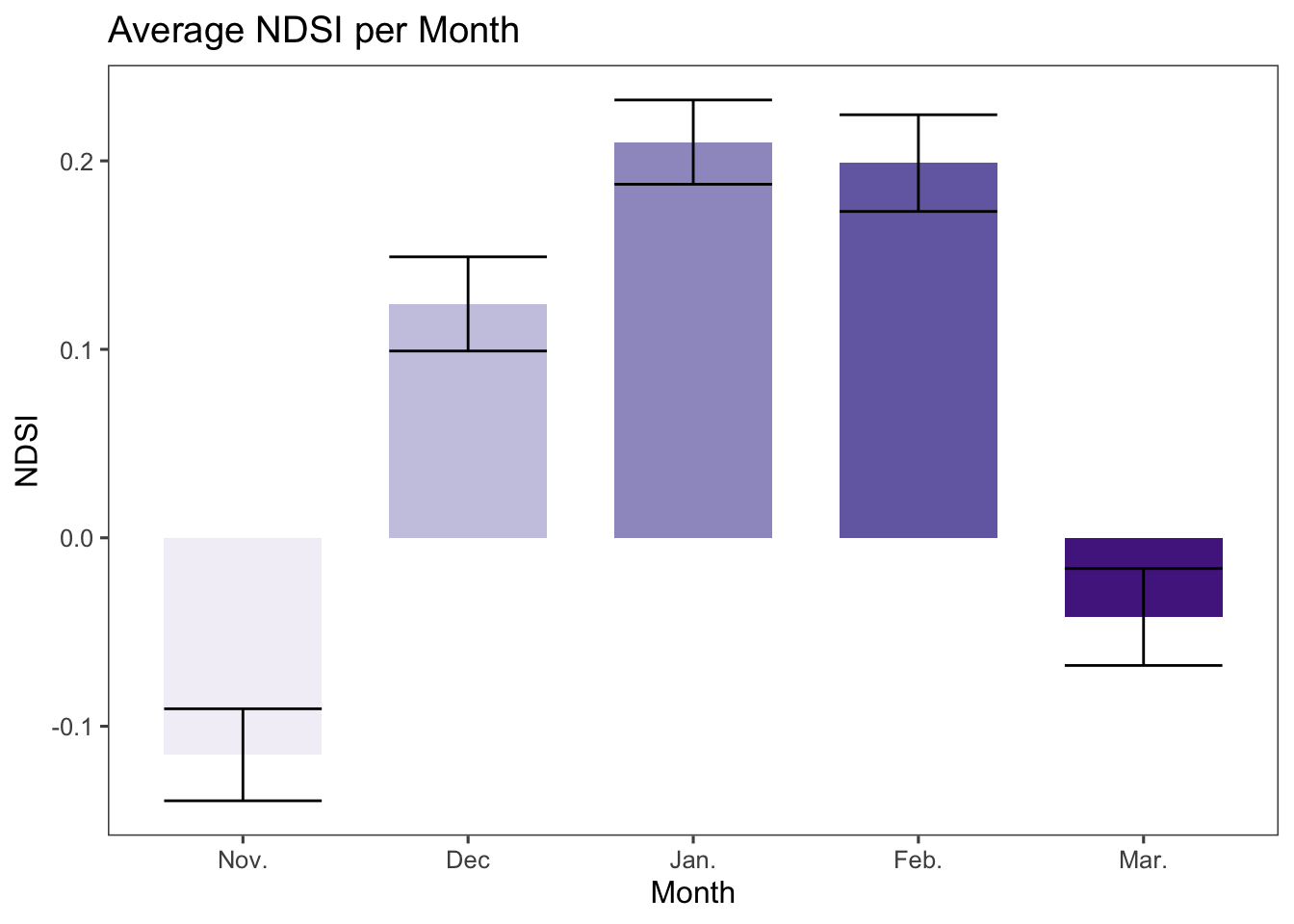
Figure 3.4: Mean NDSI and standard error per winter month across sites from 1984 to 2019.